
Peter Saville is far more than the design guru behind Factory Records, he did numerous album covers for the likes of Roxy Music, Peter Gabriel, Ultrovox, Pulp and even Wham! before lending his creative juices to John Galliano, Yohji Yamamoto, Christian Dior and Stella McCartney. He was Creative Director for his hometown Manchester in 2004, and in 2010 designed the England football kit. Saville connoisseurs inevitably return to his classic early creations for Factory.

Saville made his name creating beautiful, provocative album covers in the anarchic golden age of Manchester’s Factory Records (late ’70s and ’80s), as well as for other regional ’80s music pioneers including OMD. Principally inspired by Herbert Spencer’s Pioneers of Modern Typography. Here are some of my favourite Saville creations…

Yes, you’ve seen it on a thousand T-shirts, maybe without knowing it was Saville’s iconic design for Joy Division’s debut album, culled from a wave image in the Cambridge Encyclopedia of Astronomy. Began a Factory tradition for omitting the band name and/or album title from the cover artwork. According to Saville: ‘Having the title on the front just didn’t seem necessary. It was the post-punk moment and we were against overblown stardom. The band didn’t want to be pop stars’.

The cover image for Closer is an actual tomb in a Genoese cemetery, inadvertently given greater significance when Joy Division lead singer Ian Curtis committed suicide. Saville says: ‘There was great deliberation as to whether to continue with it. But the band, Ian included, had chosen the photograph. We did it in good faith and not in any post-tragedy way’.
This is actually the re-issued cover but sums up much of the Factory design ethos. Die cast cut-out outer sleeve (of the Factory logo) with an inner sleeve of heavy sandpaper. Almost the definition of impractical. The artwork and design is a reference to the work of the Situationist International, a mid-20th century group intent on disrupting the spectacle, the group’s interpretation of advanced capitalism.
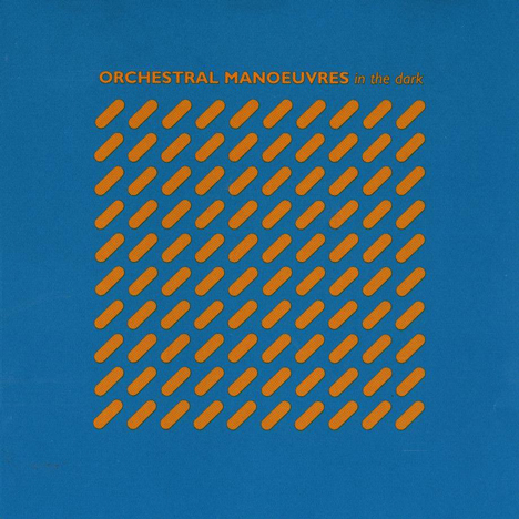
The sleeve for Orchestral Manoeuvres in the Dark’s debut album of esoteric synth was a collaboration between Saville and interior designer Ben Kelly, based on a Kelly design for a door. Also featured a die-cut grid revealing the orange inner. Saville and Kelly won a Designers and Art Directors Award for their work, though, not for the last time, the extravagance of the design impacted on the album profits.
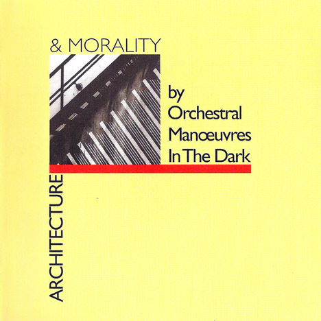
Issued in both canary yellow and sky blue (I have both), grey and a very collectible rare green, OMD’s best album, with suitably grand title was the work of Saville and designer Brett Wickens. The square cut-out reveals an un-named industrial image, and once again invokes the post-punk ethos, and perhaps some northern wasteland grit. The album features both renditions of Joan of Arc, both Top10 hits.

Still the biggest selling 12-inch of all time, the cover for Blue Monday (yes, it’s not an album) is legendary both for innovative design and being so expensive, any profits from record sales were gobbled up by the cost of the sleeve. Replicating a floppy disc with with three holes cut in it through which you could see the metallic inner sleeve, as with much of Factory’s output, New Order, Blue Monday (and B-side The Beach) were reconceptualised via colour codes, unfathomable to almost everyone who bought it.
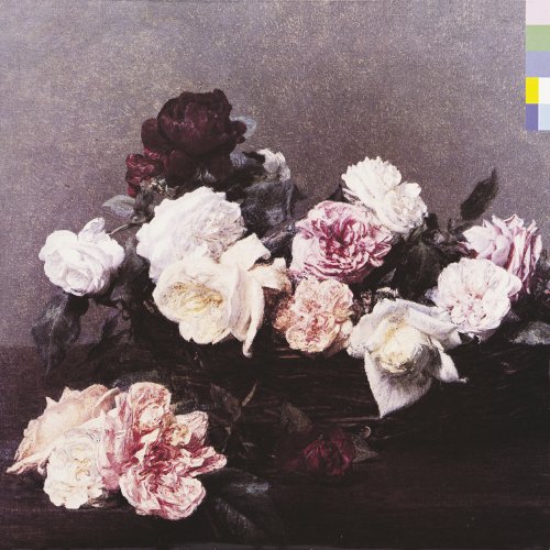
One of the great album covers of all time, let alone for it being arguably New Order’s greatest creative moment, Inspired to match his interpretation of the title Power, Corruption & Lies as Machievellian, Saville found A Basket of Roses by French artist Henri Fantin-Latour in the National Gallery. The reproduction on the cover created a contrast between the romantic and classic image, stark typography and the heavily electronic ‘machine-music’ of the album. This time Saville included a colour wheel key to the coding.
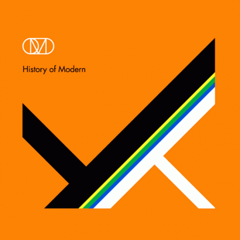
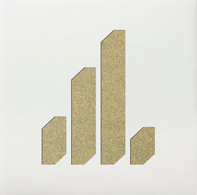
The semi-triumphant return of OMD from ‘going pop’ in the late ’80s and early ’90s, before break-up, History of Modern not only reunited Andy McClusky and Paul Humphreys but the band and Saville, working with designers Four23. Reflects Saville’s interest in post-modernism, explored further by his limited edition designs to accompany the V&A exhibition Postmodernism: Style and Subversion 1970-1990.
