
Arguably Jonathan Ive of Apple’s moment of transition genius was the iMac, which more than anything else established the home computer as a desirable object in itself. Not just a piece of equipment but a lifestyle accessory. Followed of course by iPad, iPhone and Apple Watch. Except he was only following in the footsteps of Olivetti, who similarly took an until then purely functional entity, the typewriter and created something above and beyond.
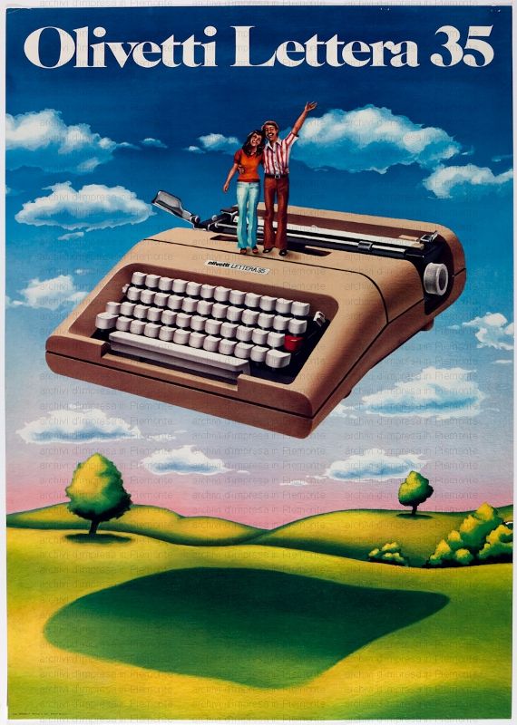
Olivetti were renowned for their attention to design, from corporate branding to the shape of a space bar. Most famously this was working with Ettore Stottass on the Olivetti Valentine. Introducing the second most stylish semi-portable typewriter, circa 1972. The Olivetti Lettera 35. Another example of Olivetti collaborating with one of Italy’s leading architects and industrial designers Mario Bellini. Where neo-space age design meets traditional typewriter. Both this and the Valentine take pride of place in the permanent exhibition of the new Design Museum.

Like the Valentine, the Lettera 35 comes in a funky carry case, although with its metal casing, this is only a semi-portable (in the portability criteria of the pre-laptop and tablet generation). Semi-space age futuristic design with its elegantly curved body and minimalist style in utilitarian ‘wheat’, it’s the Hayward Gallery, the Swiss Army Knife, the Stan Smith or the Levi 501 of typewriters. Unlike the Valentine, the Lettera 35’s performance matches its good looks and was the rumoured weopon of choice for Cormac McCarthy, John Updike and Francis Ford Coppola.

The body architecture of the Lettera 35 is a study in controlled form through plane, line and curve which echoes earlier treatments to Olivetti typewriter casings (such as the Ico) and establishes the ’35 within the philosophy of Olivetti design. The blunt Concorde-esque nose mirrors the simple treatment of form at the typewriter’s rear. The die cast aluminium casing joints are not flush leaving powerful visual lines along the side that emphasise the dropped nose and a cheeky single red (highlight) key presents a deliberately incongruous highlight to the keyboard.
